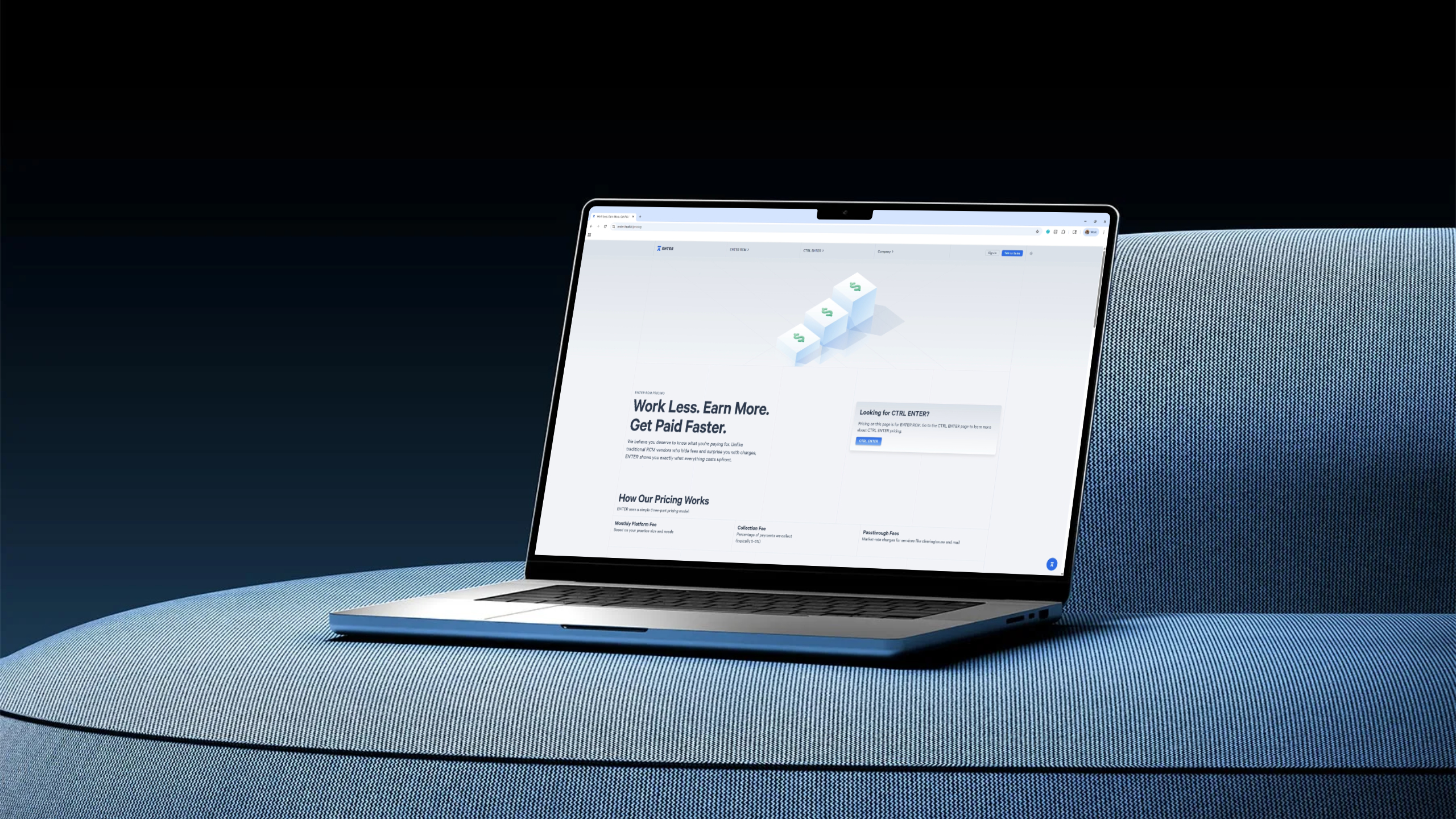
I led the brand identity, website, and launch video for ENTER, an AI‑powered Revenue Cycle Management platform.
My goal was to translate an extremely complex, technical product into a clear and confident narrative that healthcare leaders, clinicians, and revenue teams can understand at a glance.
Brand Identity
When I started, enter had a loose brand identity that no one was particularly happy with. It felt too cartoony. Visually, they needed to grow up. The thing that got me the team’s buy-in was this slide that said “Healthcare Providers: They use iPhones, drive BMWs, and put up with software that looks like this every day”
The logo is based on the ⌅ (enter) symbol, as opposed to the ↵ (return) symbol. I tweaked the brand font, Calibre, to create a custom monospaced wordmark that sits within a signature 5 column grid – a structure repeated throughout the website.


ENTER in 30 Seconds
For the website’s opening section, I created a looping motion graphic demo of the ENTER platform, highlighting four core features: the AI chat interface, verifications system, claim timeline, and payment tracker. No narration, just the product in motion.
I created the video using Cavalry, making use of their Duplicator to recreate our user interfaces. Detailed dashboards don’t usually read well on video. I prioritized creating clarity over making something that looked identical to the product.
Website
The ENTER Website had to do a few things. It had to educate clients about RCM in order to show them that our AI RCM solutions will save them time and money. It also had to be a knowledge base for existing users, and a content platform for our marketing team. I designed it in Figma and built it in Webflow.
The website redesign improved bounce rate by 5.7 percentage points (to 36%) and supported ~2x growth in monthly sessions, attracting 98K unique visitors since launch
