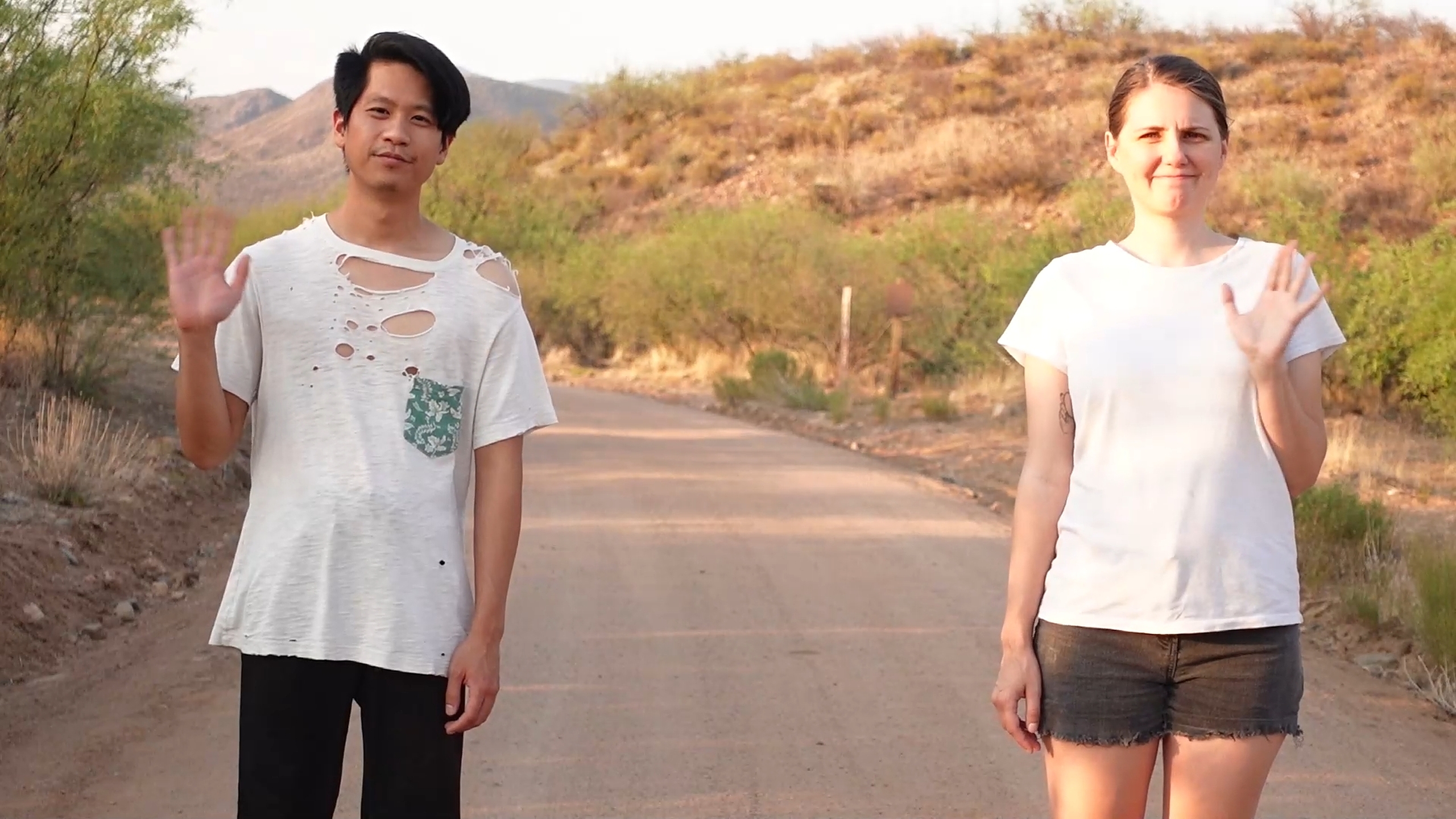
During the Pandemic, my wife and I decided to go all in on working for ourselves. The vision was to have a steady stream of profitable and creatively fulfilling work, taking on a mix of client work and self-directed projects.
Social Media
We started Sam&Mark by putting ourselves out there on Instagram. I hate to admit it, but we weren’t successful at becoming Internet famous. I think at our peak we had 400-500 followers. But we got creative, tried a lot of things and had some meaningful interactions with content creators, designers and friends.


Brand Identity
This is probably the most me brand I’ll ever design. The logo is a pair of socks and sandals: a pairing that is not supposed to work, but still kind of does. It’s flat, but the logo was actually designed in 3D and rigged for animation. We paired it with a color system inspired by the optimism we felt looking at the Arizona sky (we moved to Arizona at the time and were very excited).


The Website
We needed a website to show the world who we were and what we could do. I designed the website in Figma, and we contracted Bike Bear, a creative agency to build it. The website pitched our services, showed case studies of our client work, and we had a poster and T-shirt for sale on our online store.
Nexus Towers
Nexus Towers is a team of brokers representing the people leasing land or rooftop space as cell sites to mobile internet service providers. They wanted to stand out with a brand that was equal parts personable and professional. We came up with the idea of a pigeon as the ultimate urban expert. Based on that, we built the brand identity, designed their website, and marketing materials like folders, email newsletter template, business cards and Google Display Ads.


Kham Do Art
Kham Do Art is the brand for Kham Owens, a cinematographer and filmmaker in the Baltimore area. The identity evokes activism, culture, and creativity by referencing Spike Lee movie posters, textiles, pottery, and historical civil rights typography. Deliverables included the logo, icon, color and type system, patterns, and a set of collateral: business card, letterhead, invoice, and email signature.


Clare Witchbaby
Clare was a Twitch streamer who specialized in streaming The Sims to an audience of young women. She wanted a brand that presented her on the level with the top content creators in her niche. Beyond the brand identity, we created modular assets that could be mixed and matched throughout her stream. This is a big enough project that it deserves its own post, which is up next.
